How to fix dangling arrows
Came accross this question in a community I am in:
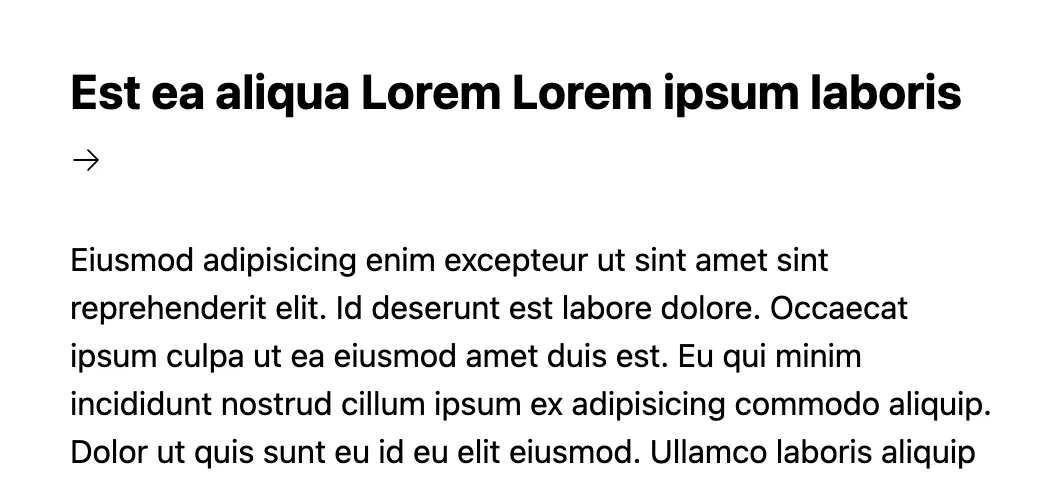
Working on a thing for work. I need this arrow to ALWAYS be inline with the text
With a screenshot simular to this:

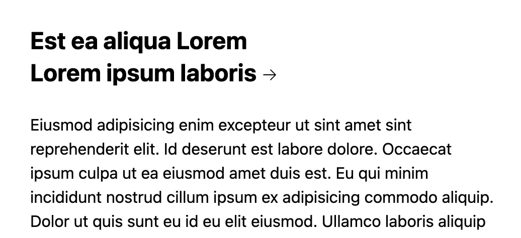
There were many creative solition from the group, but for this problem I like to reach for the newish css text wrap option balance.
CSS Solution:
h2 {
  text-wrap: balance;
}
Tailwind Solution:
<h2 class="text-balance">...long title that will break...</h2>balance tells the browser to make each line as equal in width as possible, resulting in no single word or arrow left on a line by itself.

Note that the icon must be inline with the text in the HTML for this to work. If you are using an svg for instance make sure to set it’s display property to inline-block.
For a full demo in Tailwind and React, as that was the OPs tech stack, check out this CodeSandbox.